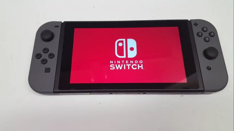
A video uploaded to vid.me that shows the Nintendo Switch’s OS in action is making the rounds today. Posted by user ‘LightKiosk’ to the NintendoSwitch subreddit, it shows the system’s startup animation and follows the user through initial configuration options and to the system’s main interface.
The Switch is featured exclusively in handheld mode and not docked during the three minute video. Using the system’s touch screen, the user sets their language, date and location options, which are standard fare for any modern system. Connecting the Switch to a TV is optional during initial setup, and the system prompts you for a preference of playing with the Joy-Con controllers attached or detached.
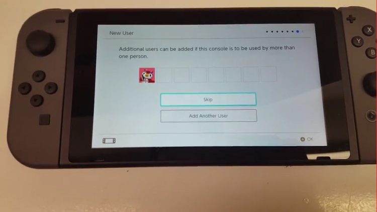
New user setup begins with setting an icon and nickname. Pre-loaded Icons include portraits of familiar Nintendo characters, and there’s an option to enter the system’s Mii maker app. The Switch then adds the created user to the first of eight slots and indicates that additional users can be added if the console is to be used by multiple people, confirming a rumor from not too long ago that the system would support multiple user profiles.
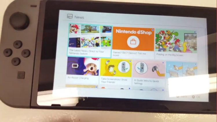
Once setup is complete, the Home button on the right Joy-Con sends the user to the system’s main UI, where a row of large empty squares run over small circular icons for various system functions. The News section appears to be an evolution of the 3DS’ Notifications function, and currently lists a number of how-to and help articles specific to the Switch. Although an icon for the eShop was present, accessing it required a system update that the user passes on, so we unfortunately don’t get to see it in action. It does look as if it’s the same eShop the 3DS and Wii U connect to, but we’re still not sure how accounts between systems will tie together, if at all.
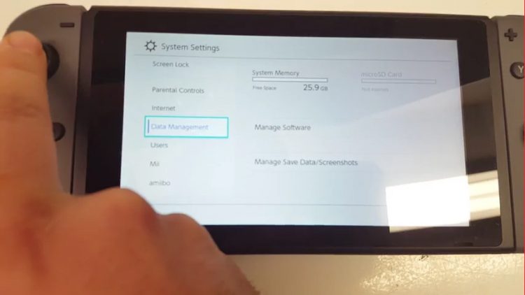
The next system icon is for a dedicated section for screenshots captured by pressing the Capture button on the left Joy-Con controller. Next to that, management for the system’s controllers gives users the ability to change their preferred grip and the order of the controllers, pair new controllers, and gives battery life indicators for both Joy-Cons and the Switch itself. Lastly, a general System Settings menu allows for adjustment of screen brightness and locking settings, airplane mode for the system, parental controls, and so on. The Data Management section of this menu shows the system’s free space at 25.9GB out of its 32GB total onboard storage, meaning that 5GB is consumed by the OS itself.
It’s only two weeks away, and it seems like there are still so many unanswered questions, even after the leak of in-development UI mockups to Reddit a couple of days ago. The OS at least seems snappy and clean, as it maintains a nice, simple design that’s somewhat less messy than the 3DS and Wii u’s interfaces could become.


