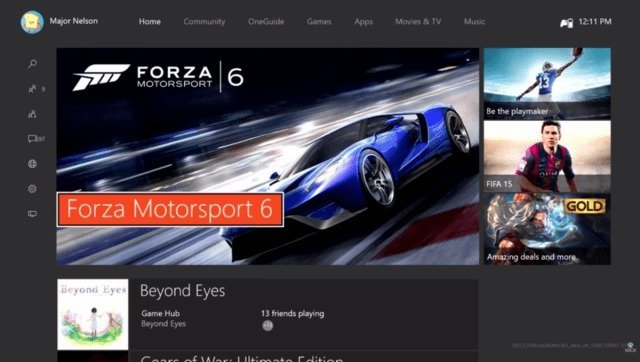
A short while ago, it was announced that the Xbox one would be getting a major overhaul as far as it’s home UI was concerned; dubbed, “The New Xbox One Experience”.
Last week, details on how to sign up for beta testing this new UI were released; and now, the changes themselves are actually making their way to players who signed up.
The changes are a work in progress, but the new changes that can be seen in the new Xbox One experience include:
- A vertical scrolling list as opposed to the horizontal one (this means no more having to pass over the ads on each tab as they are still on the right of the tabs)
- Bindings for Pins and current activity (LT sends you to the top of your list, meaning your current game or app; and RT sends you to your pins)
- The new guide (the main feature of this new experience. Simply put; it groups up all the loose social and utility apps such as parties, game DVR, TV, messages, ETC into one easy-to-access tab on the left side of the screen.)
It is currently unknown how much of this will stick or how many features we can expect to be added to this, but this shows promise in terms of user friendliness for the Xbox One; perhaps now I can finally stop yelling into my Kinect as often for being unable to locate the proper app.
[youtube http://www.youtube.com/watch?v=ex1WjrkLjAA]
You can find more in-depth information here at Major Nelson’s website.


