When you’re in business, it’s good to be prepared, but sometimes life happens in a way you don’t expect. Project leaders are typically very used to this, but that doesn’t make their stress levels any lower when it happens. Sometimes you’re caught unawares by a sudden presentation, and you have little to no time to prepare before you have to be in the office, at the front, pitching your idea for a company or organization. Sometimes you just want a logo that looks snazzy, if only to show it to potential business partners.
Fortunately, there’s good news for the savvy businessperson on-the-go. If you’re short on time, DesignEvo has you covered. It’s a free, easy-to-use application that gives you a lovely selection of tools to create a professional-looking logo. You can drag-and-drop images and text boxes, then rotate, resize, or replace them – and you can do it from your computer, or your phone.
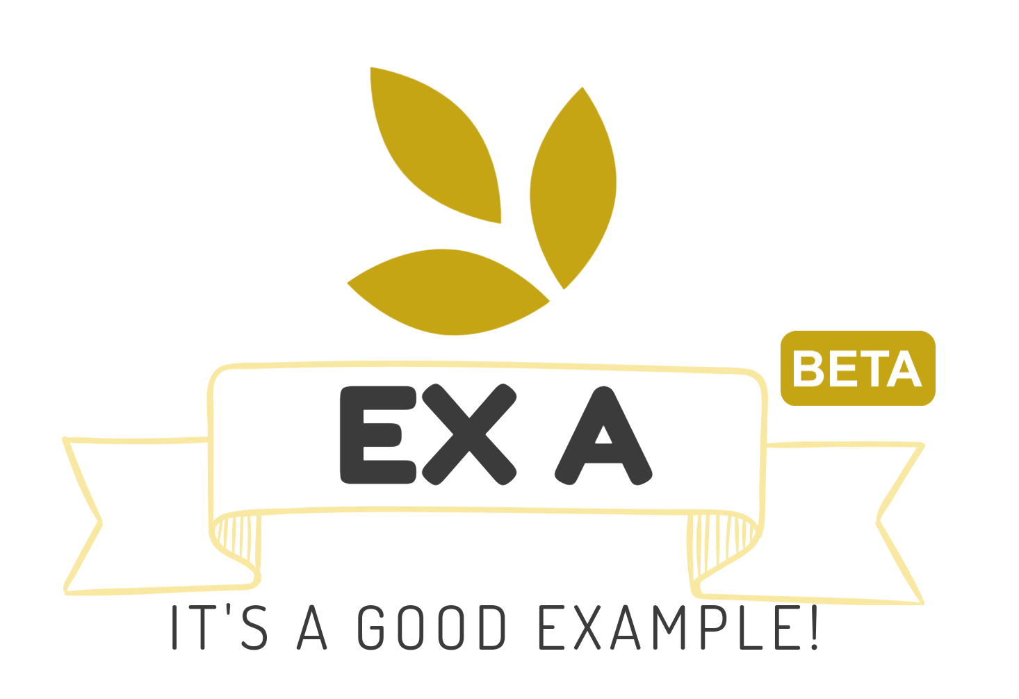
I spent about 20 seconds in the app and came up with this. It looks pretty spiffy for a start!
DesignEvo takes three different forms. The simplest, and likely the most accessible, is the phone app. In under a minute you can jump right into creating and editing a logo. There’s no tutorial, because for the most part, it isn’t necessary. Much of the layout of the app is intuitive. If you see a logo you like, but think it could use a bit more pizzazz, you click on it, which takes you to the editor. The editor then gives you access to the many options DesignEvo offers, and from there, everything is literally at your fingertips.
For those who enjoy a little more finesse in their logo-creation, the other two forms of the app are a desktop and web version. The web version fits neatly inside a tab of your browser, and the desktop version is its own downloadable application. At the moment, however, it’s only available on Mac computers.
The Good
DesignEvo is a great tool, and I can say that without a doubt in my mind. It provides an accessible way for people to create their own logos, or at least to create an example or placeholder logo. I was pleasantly surprised by just how intricate the mobile editor was, and how the application managed to present all the options without overwhelming the viewer. Everything is organized, clean and efficient, and rarely will you be shown more than four buttons at a time. Sliders and dropdowns allow you to alter the look and feel of your text, and simple touch controls can alter your images.
Speaking of images, the free library is rather impressive, and it’s key to keep in mind that’s just the free content. If you’re willing to dish out the money, you can get a whole bunch of logos of different types from the marketplace, and every one of them is clean and beautiful. I have major respect for the time and effort that was put in to allow access to this wide an array of assets. Everything is sorted meticulously by category and possible applications. If you don’t have a solid idea of what department your organization falls into, fear not – there’s also an extensive “Abstract” category.
My personal favorite aspect is the snap tool, which positions your images and text along the center axes of the canvas. It’s simple, no-fuss, and if you don’t want your image snapped to the center, it doesn’t put up too much of a fight. Asymmetry is in these days.
Aside from functionality, the philosophy behind DesignEvo is also pretty admirable. According to their website’s About page, Pearl Mountain created the app after the success of their widely-popular FotoJet, with the intention of helping people “accomplish their creative goals.” With that focus in mind, it’s easy to understand the bite-sized approach Pearl Mountain decided to take. This application is going to help a lot of people, and I’m looking forward to seeing what they do with it.
The Bad (or more specifically, “Disappointing surprises”)
I come from a unique perspective because I’m not quite the target audience for this app. I’m an artist, and if I needed a logo, I could open a vector program and make one without too much of a fuss. I don’t mention this to discredit DesignEvo – on the contrary, it helps me appreciate just how much this little app can do. However, this perspective grants me a few insights that make me worry about the limitations of DesignEvo, because there will be times when the app’s extensive options aren’t quite enough.
The biggest thing on my mind was the resizing options. DesignEvo, on web and mobile, offers a simple and easy way to resize images, but that resizing can only make an image bigger or smaller, not wider or taller. For most things, this makes sense: If you want a clean-looking logo image, you’re probably not going to want to squish it. The people who made that image struck the perfect visual balance already, there’s no need to change it. It becomes a bigger problem when it comes to banners and borders. With no way to lengthen the banner I selected in my “EX 1” example, I was forced to settle with either a short title, a smaller font, or both.
Even though this is a significant problem, it wasn’t so significant that I wasn’t able to continue making logos. Sometimes compromise is necessary, and even the best technology has limitations. This is a feature I think could improve the app, but it’s understandable that it might not be feasible, or perhaps offering it would make the app too busy, or too difficult to use. After all, you can only put so many buttons on a tiny phone screen before misclicks start happening.
My only other suggestion is one that was included in the desktop version, but not in mobile: Gradients. It could be nice to see patterns too, but gradients are neat when you’re looking for an eye-catching logo. Mobile offers a wide array of colors, as well as a color picker if you’re feeling fancy, but no gradients – which is alright, really. It just means that the more enhanced options will be on the version accessible by an actual computer, which is true of most applications in general.
The Ugly (or, “Significant, performance-impacting problems”)
My only notable complaint about the app is this: On mobile, every image is treated as a square image. It doesn’t matter how much of that square is occupied by empty space, or how rectangular and thin your line might be, it will always be treated as a square image. This wouldn’t be a huge problem, if it wasn’t also a pain to select assets from beneath other assets. For text-only logos, there’s little to no problem, but if you plan on adding images, you’ve just got to grit your teeth.
This problem doesn’t appear in the web version of DesignEvo. After using mobile, the in-browser editor was a relief. I finally felt like I could somewhat control assets in a way that made sense, and it seems as if that was how it was meant to be used: From a computer, with a mouse. The app seems as though it’s only a taste of what you could have, but for a taste, it’s still rather good.
Overall
DesignEvo is an application that can allow small business owners to create new logos with little problem, if they don’t have a graphic artist at their disposal, as long as they have a foundational understanding of color and space. Yes, there is an opportunity to improve, but there’s an opportunity to improve in every application that has ever existed. I don’t believe it should be judged harshly just because it has room to grow. If you’re looking for a logo and you don’t have the means to hire a designer, DesignEvo is a wonderful, simple way to do it.
You can find DesignEvo for mobile on the Google Play Store and the iPhone App Store, or download the desktop version on their website, here.
DesignEvo
Summary
DesignEvo is a helpful, accessible tool for cleaner, more professional design, and it’s extremely high quality, especially since it’s free.


