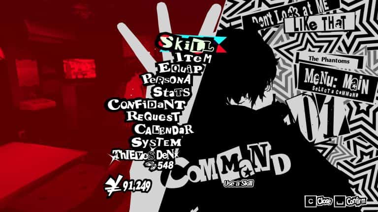
You can always tell the good games from the great ones and the masterpieces by the level of detail and love that went into making the title special. Yes, the story, visuals, and gameplay are all important, but without the “connective tissue” to make it all pop, it only feels basic at times. That’s likely why the Persona franchise started out as a niche RPG series until Royal came around and stylized everything to high heaven. Among that overhaul were the breathtaking and innovative menus that made the game look like nothing that came before.
What might surprise you, though, is that while the Persona team used that design aesthetic for future titles and remakes, including the upcoming Metaphor ReFantazio (read our review!), it’s actually a bit “annoying” to make, according to the series director Katsura Hashino. He talked with The Verge about the menus and dropped this interesting factoid about making the menus:
In general, the way most game developers make UI is very simple. That’s what we try to do as well — we try to keep things simple, practical, and usable. But maybe the reason that we’ve achieved both [functionality and beauty] is that we have unique designs that we make for each and every menu. This is actually really annoying to do. We have separate programs running for each of them as well. Whether it’s the shop menu or the main menu, when you open them up there’s a whole separate program running and a separate design that goes into making it. It takes a lot of time.
So, yeah, the next time you play an Atlus title with those kinds of menus, spare a thought for the team that worked REALLY hard to make it all work. It wasn’t easy.


