Sony released a recent video detailing the User Experience for their upcoming Playstation 5 console, this includes our first look at the UI for the console.
You can watch the video for yourself below.
For those of you who can’t be bothered sitting through the video, here’s an overview of what was covered in the video above:
- The overall interface is from a pre-production version of the UI, so some things might change by launch
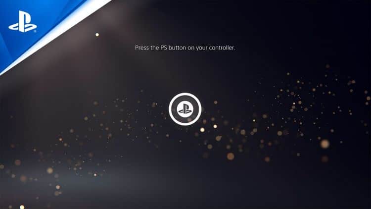
- The opening is still very much the same as the PS4, with a Username login
- The “control center” shows all the menu options on the lower part of the screen
- The menu consists of Home, User, Notifications, Online Players, Music, Volume, Mic, Controller options, Online Profile, & Power.
- A new “cards’ layout is the main way users will interface with the console itself, including games, news stories, etc.
- Cards can show things like progress in a suspended game, as well as activities (A small challenge/achievement system), and trophy progress.
- Activities can show hints for their objectives in-game
- The PlayStation button can allow access to joining party chat features (If you don’t mind Sony listening in)
- Parties can do more than voice chat, but also screen sharing from other games while you play your game
- The PS5 is always capturing footage, but only available via screenshot and video editing modes.
- The “Home Screen” has been optimized for 4K with a minimal look, much like the PS4 UI
Overall the PlayStation 5 user experience doesn’t change too much from the Playstation 4 design, but enough that it is more accessible and easier to use than it previously was. The Outerhaven will have hands-on reviews of the Playstation 5 come to launch and beyond.


