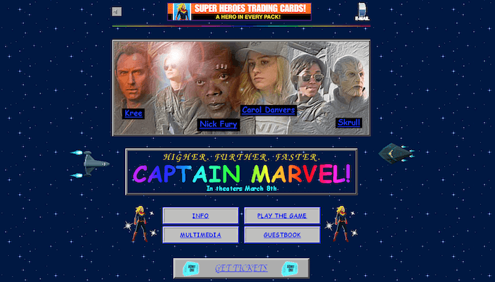
Remember the 1990s? Bright colors, weird prints, desperately trying not to let the 1980s die as we slid closer and closer to the new millennium? Good times, good times. But there’s one thing my little millennial brain remembers about the 1990s, it was the internet aesthetic. Word art, Flash graphics, viewer counts and yes, oh yes, star-themed backgrounds. Well get ready to relive that glorious time with the official Captain Marvel movie website.
Now, you might think that it’s silly to do a write up about a website, to which I inquire if you have actually clicked on the hyperlink above. Most movie websites are designed to look modern, streamlined, and enticing. The whole idea is to make the website look as good as the movie will (hopefully) be. But Marvel, being the evil geniuses they are, went with the opposite approach. The film takes place in the 1990s, before all the stuff with the Avengers goes down, so it looked to replicate the look and feel of the era. And boy, did they nail it on the head.
We’ve got everything: low quality pixelated gifs, a virtual guestbook, sound options on the page, weird pop-up animations you can punch, those grey boxes we need to separate text from the background, comic sans font everywhere. The entire thing is a hideous, magnificent snapshot of all the bad design choices we all thought we so cool some twenty+ years ago. Of course, the site is fully functional, so you can get all the information you need on the film, its characters and the trailers. All of that is great, but it really is the thought and love that made into building this webpage that really makes the trip worth it.
Captain Marvel premieres in theaters on March 8, 2019.


