A new year and a new look
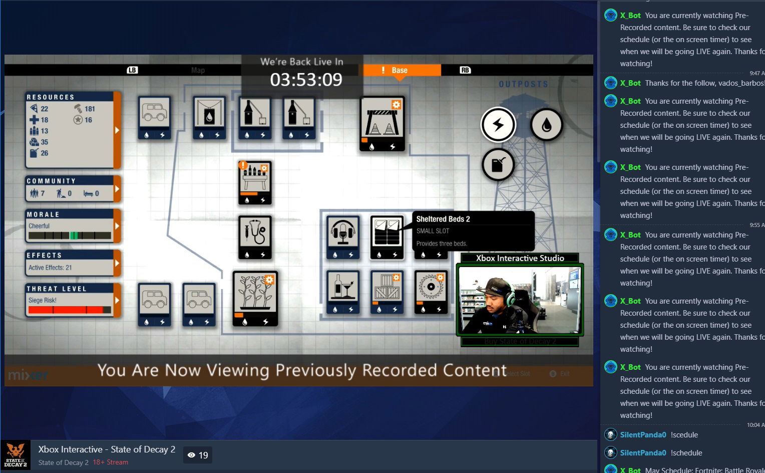
With Mixer hitting its one-year anniversary, they’ve announced a number of upcoming changes to the service. One of which is a revamp of the desktop and mobile app. For some time now, myself, as well as other streamers on the Mixer, have expressed a need to change how it looks. Or to make it easier to find games or streamers we want to watch. Well, they’ve listed and have started rolling out a new look for. Right now, only pro accounts have access to this, and it will be rolled out to them in waves. Non-pro accounts will start to see the revamp later this Summer 2018.
Of course, once I heard the news I went over to my account and kept pressing F5 until I finally saw the option to check out the new look. After giving it a test drive, I wanted to talk about what I liked, what I didn’t and overall impressions. So that said, let’s check it out.
The new look definitely makes it easier to find both streamers and games that you want to see. At the top is a streamlined menu bar that gives access to the same info. Except it responds faster and is more apparent than before. The teams and games section load quicker and showcase either the game image or team logo. Gone is the ugly left sidebar, which was clunky and took p valuable screen space. Now when you go to Mixer.com, you’re greeted with a slightly smaller featured carousel. Only this time there are bullet points and arrows for navigation.
Expanding the “More” link takes you to a section with several links, including more info on the platform, and more. There’s even a link to purchase your own Mixer swag, such as hats and t-shirts.
The browsing/searching received an upgrade. You’re able to filter out things like the new Mixplay, Costream, FTL enabled streams and Partnered streams.
There’s a Top Games section. Here the top six games are shown here, with a link to see all the games available on Mixer. These are ever changing and will update whenever a different game or category ends up in the top six games or categories being watched.
Adding to this, the theme here is to drill down, so scrolling down will gain access to more sections. Streamers you current follow now residue under the “Top Games”, with the first couple giving you a look as to what they’re planning and the number of viewers watching them. Clicking on “See All”, will show all of the people you’re following.
Slightly under that is the Mixer exclusive channels, such as their Hype Zone, Channel One, and more. Good stuff and I’m sure there will be more channels added, especially since there are a few that I watch now that aren’t listed.
The “Up and Coming” section is also intact, however, it’s been pushed nearly to the bottom. Instead of it being at the top, now you’ll need to scroll down a bit to find that new streamer who’s the talk of the town. I would have preferred that it be a bit higher, as the focus has been put on Mixer’s other attractions first. Thankfully it’s still around, as I initially feared that it had been removed altogether.
Right after is a scrolling section that sorts multiple streams by the number of viewers watching them. This is seamless and never-ending, as it looks like it goes through all the games that are being streamed at the time.
Jumping to your own account, the customization has been tweaked as well. Your VODs or past streams are given a wider focus. You still can’t rename your downloads, only the VODS. I’m just not a fan when it comes to downloading a bunch of my VODs and all the names are similar.
Your streaming page has also been touched. Before, the name of the stream, the rating and a bunch of other info sat up top. Now, this has all moved to the bottom. Meaning your video has gained a bit more screen real estate. Looking at the old versus the new look, I definitely prefer the newer look.
So as you can see, there’s quite a bit of new stuff going on for Mixer’s new look. Definitely impressive stuff, for sure.
I did incur several issues while trying to drag my controls over to the grid over in dev lab section, which also been redubbed as Mixplay. It didn’t matter what I did, it couldn’t get them to move. I’ve tried this on three different browsers, and I was still unable to do so. I also noticed that I was unable to access other portions of my account, such as the billing, analytics, at various times. That is until I switched back to my default theme, so there does appear to be an issue with the new theme. I’ve already contact Mixer regarding that, however.
Though outside of issue I experienced in Mixlab and in my account settings, I’m impressed. It’s more streamlined, looks extremely better which in turn provides a better experience for both streamer and viewer alike. I would have liked to be able to drag and drop the sections, but maybe that’s something that could be added in the future.
Of course, if you have any feedback for Mixer regarding the new look or anything else. Be sure to submit that over at feedback.mixer.com
What do you think about the recent changes to Mixer’s layout? Let us know in the comments!


