The Nintendo Switch has finally arrived and we here at The Outerhaven are diving deep into it! We are taking a look at everything that encompasses the Switch and since so many of us own one, we thought it would be fun to each list one thing we like about the console in the time we’ve had with it.
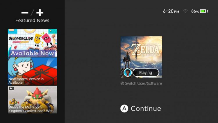
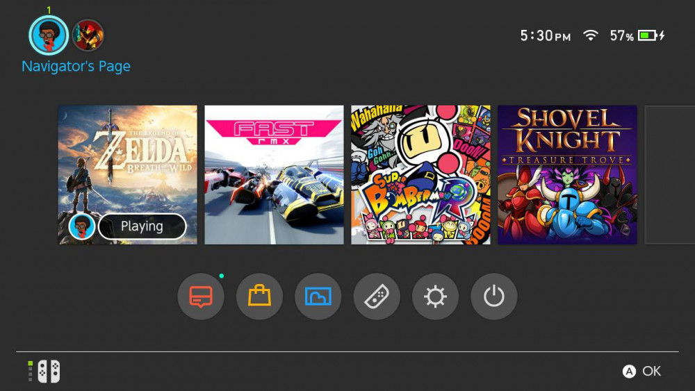
Typically, since the release of the Nintendo DS and PlayStation Portable, the User Interface (UI) of a console would be a possible make or break as to whether they stuck around or not. The Xbox 360 and Xbox One typically had visually appealing, yet sometimes unintuitive, UIs, while the PlayStation side of things would have UIs that were usually very plain and wasted a lot of space. However, Nintendo always seemed to have intuitive, yet visually appealing UIs, even counting the failure of a console that was the Wii U. This tradition continues with the Switch.

The UI may be very minimalist, but it’s sleek, it’s fast, and it’s straight to the point, and that is what makes the Switch an effective system. I can swap between my profile, and my main menu with a breeze. I can jump right back into whatever game I’m playing in a flash. The news, eShop, controller settings, power settings, all in one convenient place, doesn’t force you to go searching all over for different screens to do simple functions.

With that, I bid you adieu. What is your favorite thing about the Nintendo Switch? Leave a comment below and continue the conversation! We’ll be back tomorrow with another round of “One Thing I Like About the Switch!”


